Overview
The triple j website redesign aims to modernize the site, addressing existing issues such as an outdated design and poor mobile experience. Key objectives include creating a fully responsive and device-optimized website, establishing a clear site map architecture that prioritizes relevant content for the audience, and ensuring alignment with the DLS component library for consistent branding and efficient development.
- 2017-18
- ABC Digital Networks / Service Design
- UI / UX / Product Designer
Approach
Discovery research on triple j identified three key user needs (Jobs To Be Done): staying up-to-date with music, discovering new music, and enjoying audio companionship. These needs were central to our process and ensured we focused on our audience.
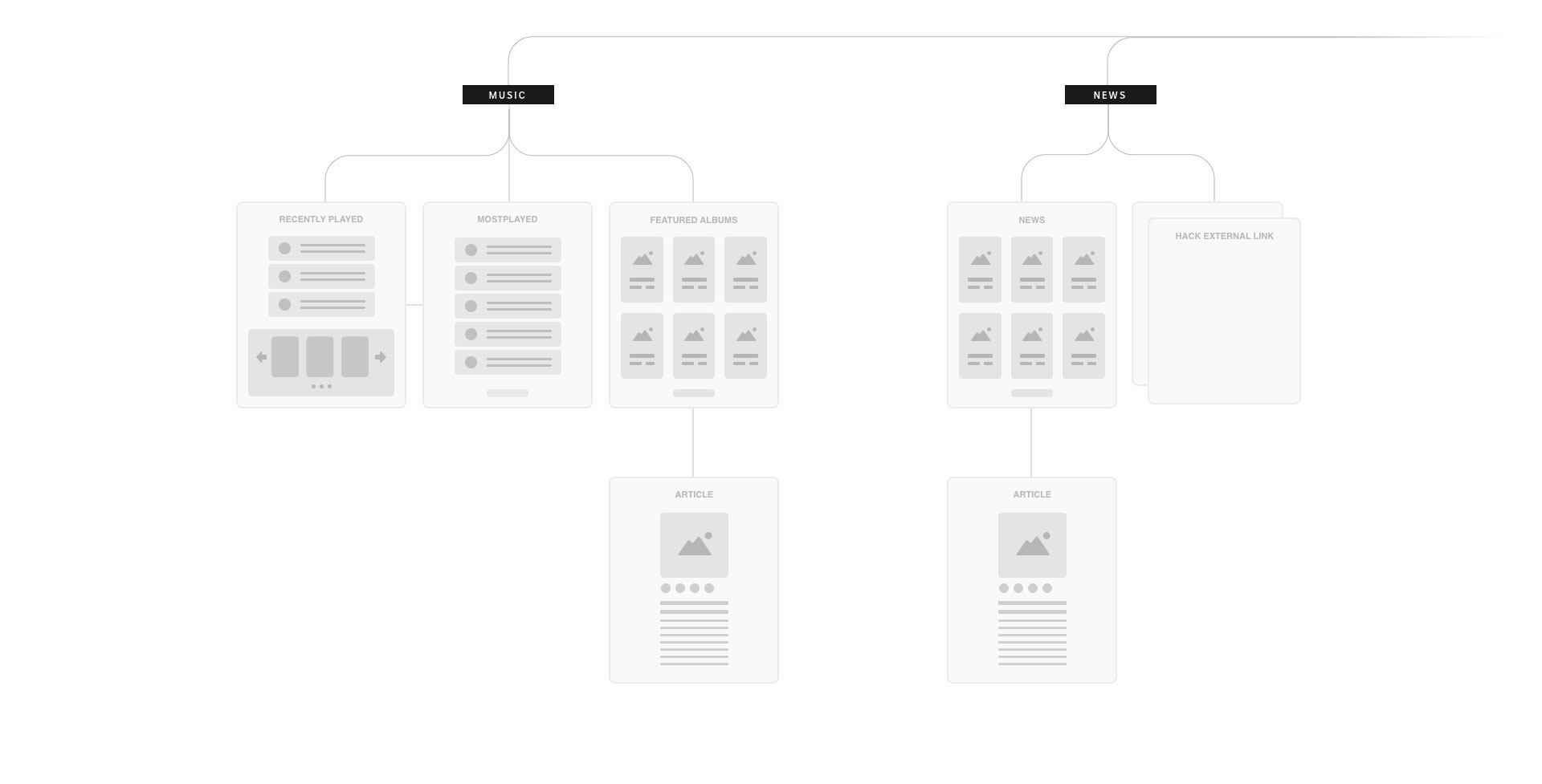
We simplified the information architecture by removing unused legacy content that offered little value to our audience and wasn’t being consumed. Based on earlier research and audience insights, we identified key content areas and conducted a card sorting exercise with members of our audience and station content creators to validate our approach. The positive results confirmed our proposed content structure and pairings. We were on the right path.
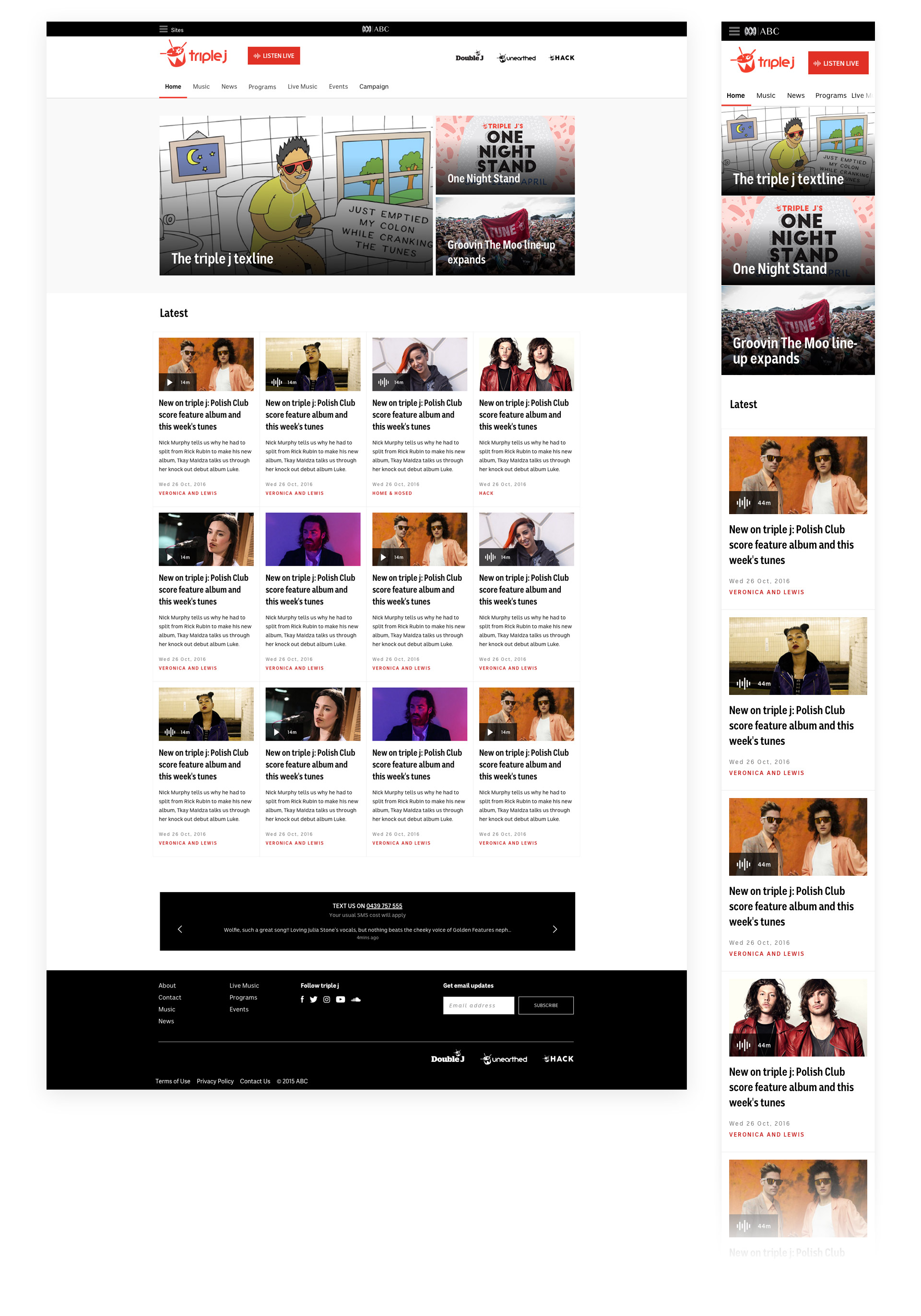
Because most of our audience uses mobile devices, we took a mobile-first approach to the redesign, focusing on creating a responsive website to address the current site's mobile shortcomings. After identifying key pain points in the current experience, we sketched initial ideas, drawing inspiration from competitor analysis to keep out minds fresh. Throughout an iterative design process, we regularly validated these ideas with developers and stakeholders.
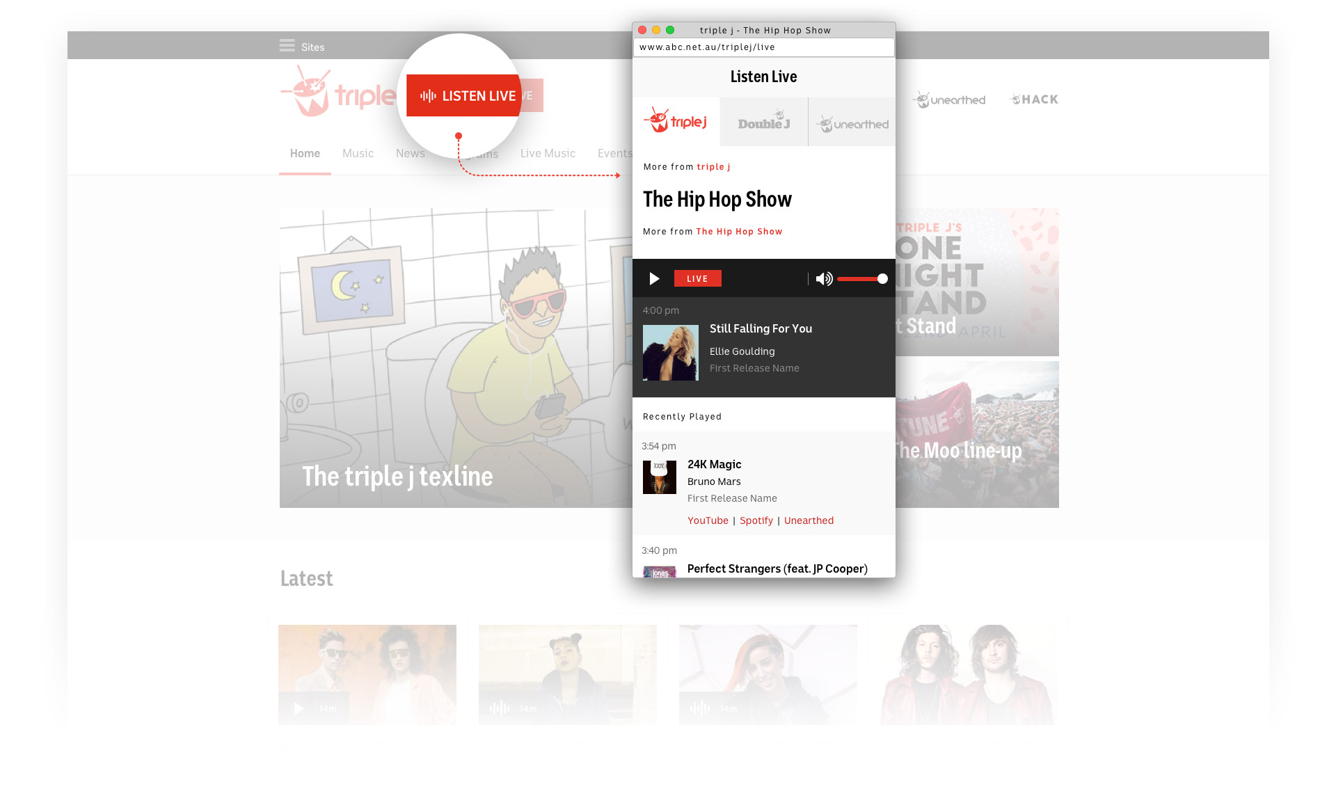
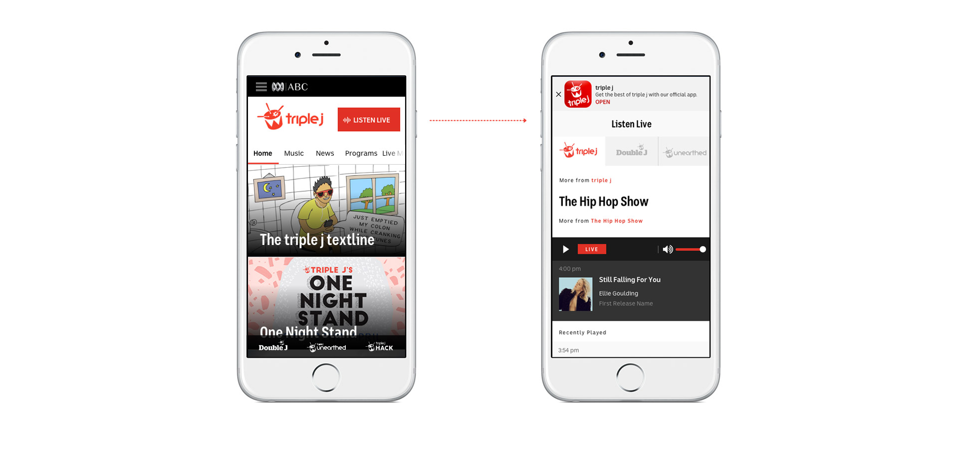
Listen Live
A prominent "Listen Live" button, accessible from anywhere on the site, launches a player with "Now Playing" and "Recently Played" information; this is crucial for a comprehensive listening experience. This feature also provides access to live streams from triple j's sister stations, double j and unearthed.
Relevant content
Editor-curated collections provide our audience with relevant content and the most up-to-date music news.
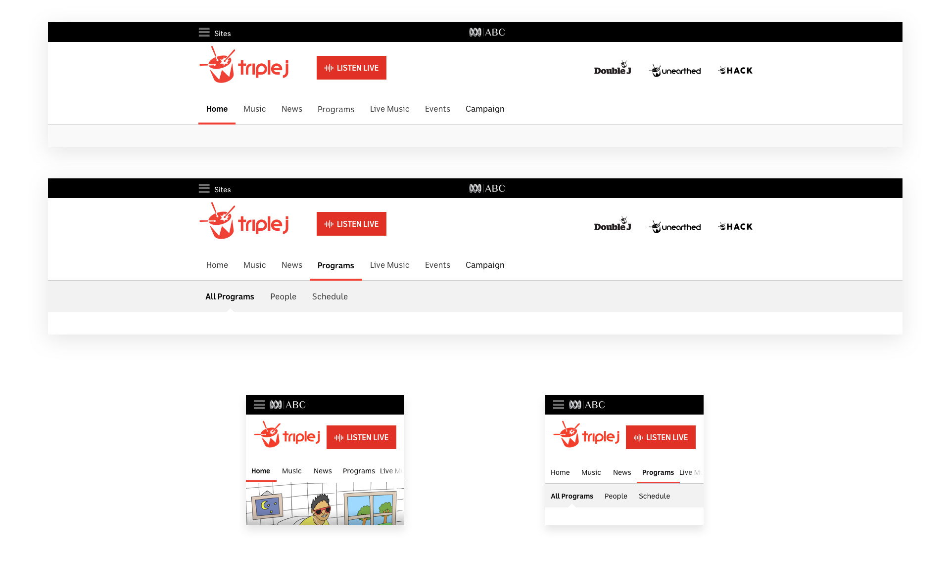
Website navigation
Consistent and flexible navigation, using standard patterns, ensures a seamless experience across desktop and mobile devices.
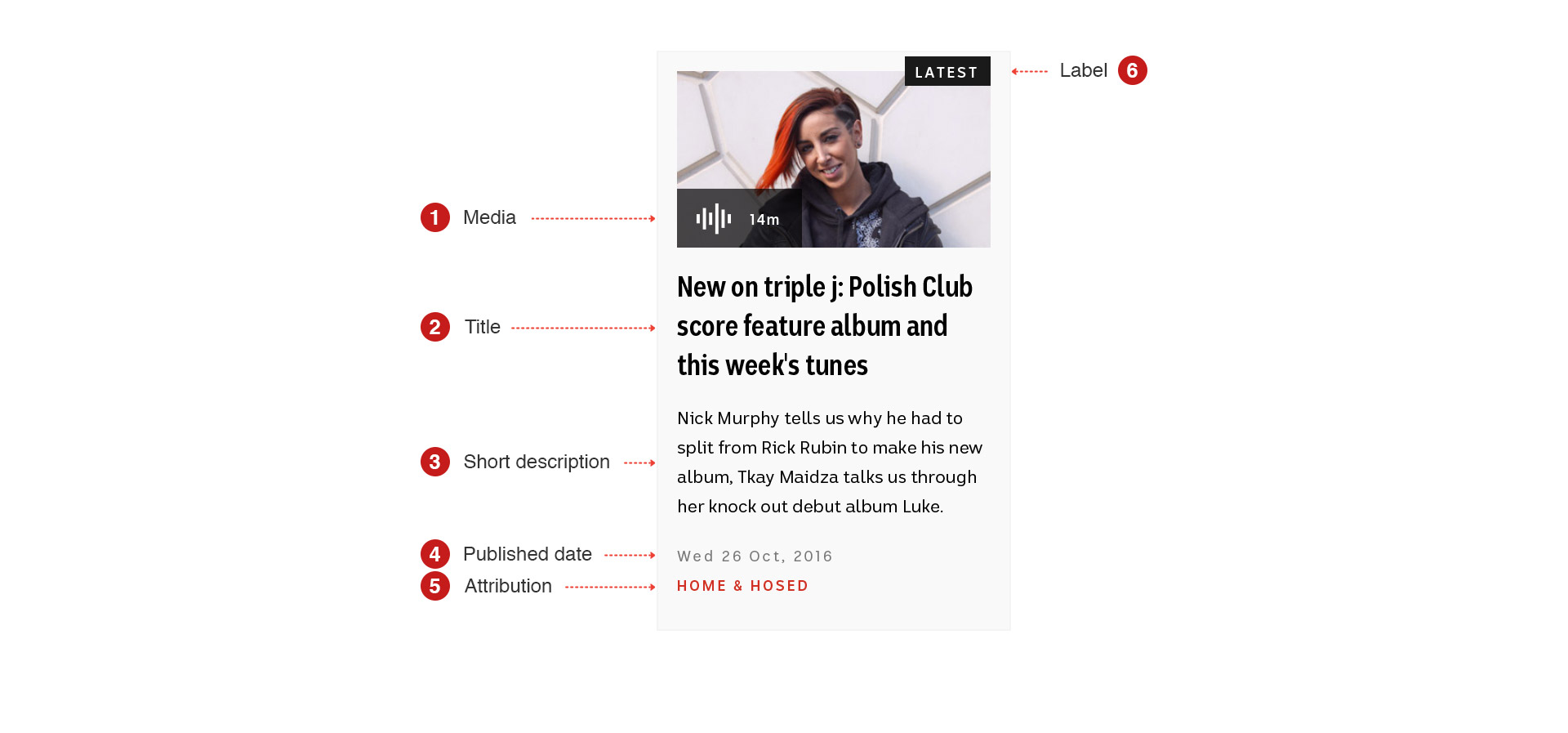
Content cards
The website's content cards are based on designs from the ABC CapCities project and refined according to the ABC Design Language System.
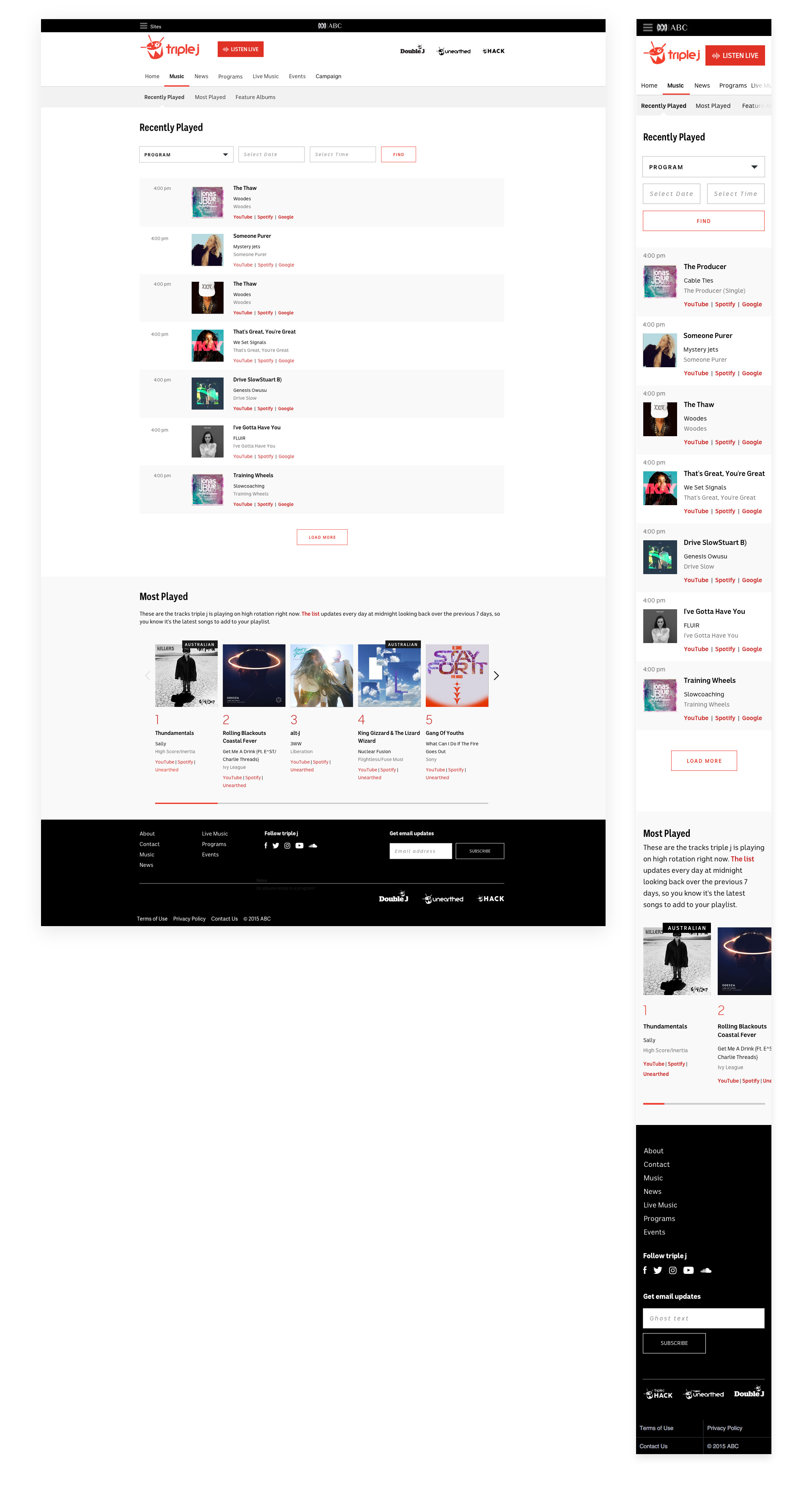
Recently played music
Music discovery helps audiences find songs from their favorite programs, as well as songs played in high rotation over the past 7 days.
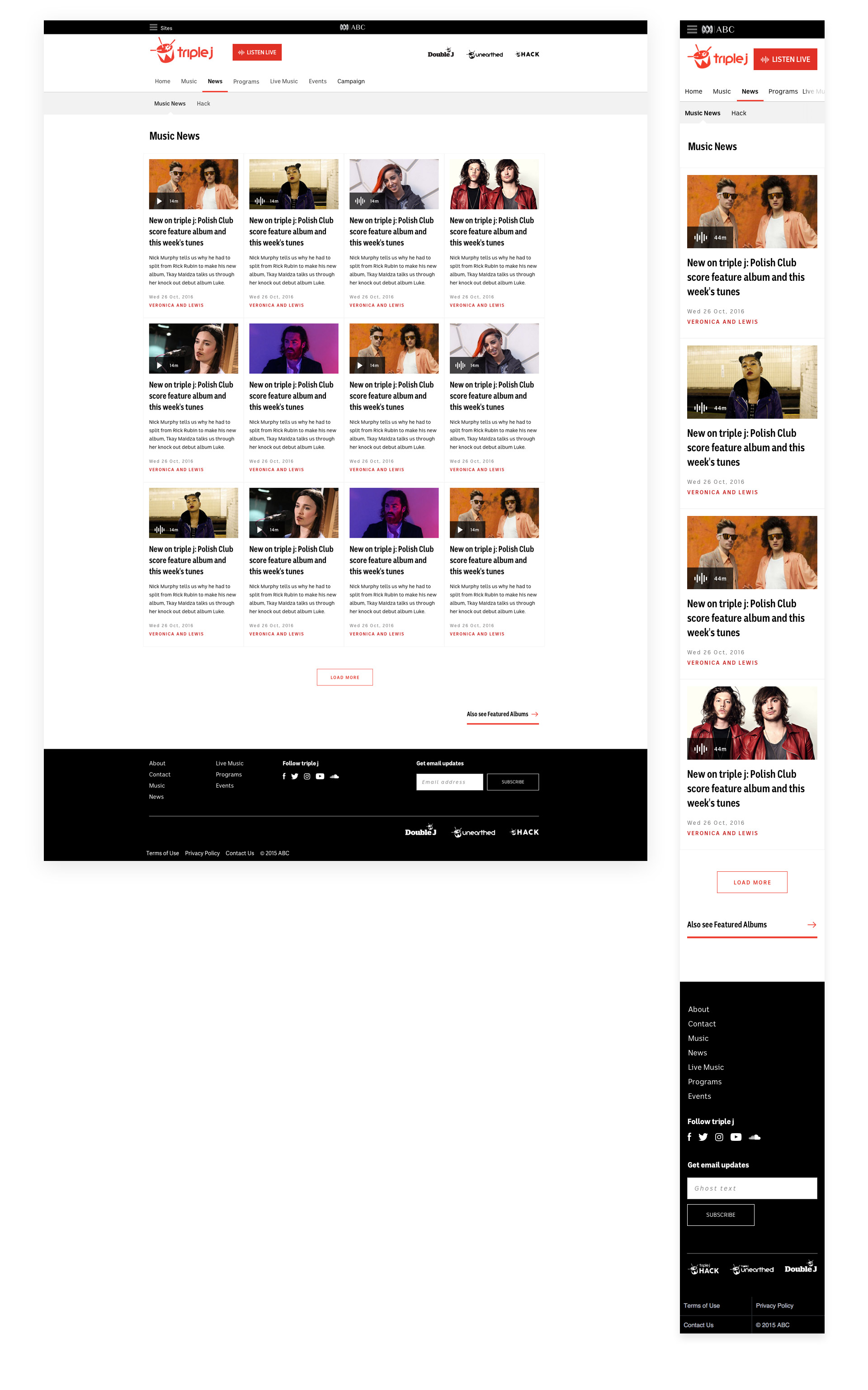
Music News
The Curated Music News collection keeps audiences up-to-date on the latest music news.
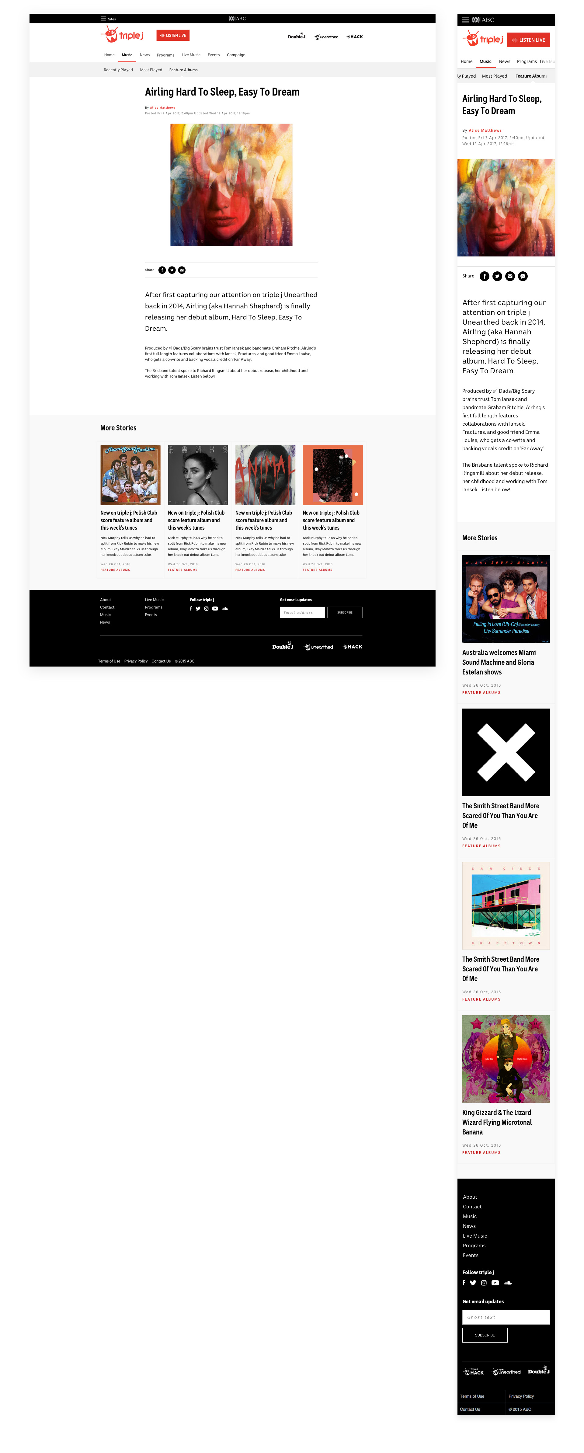
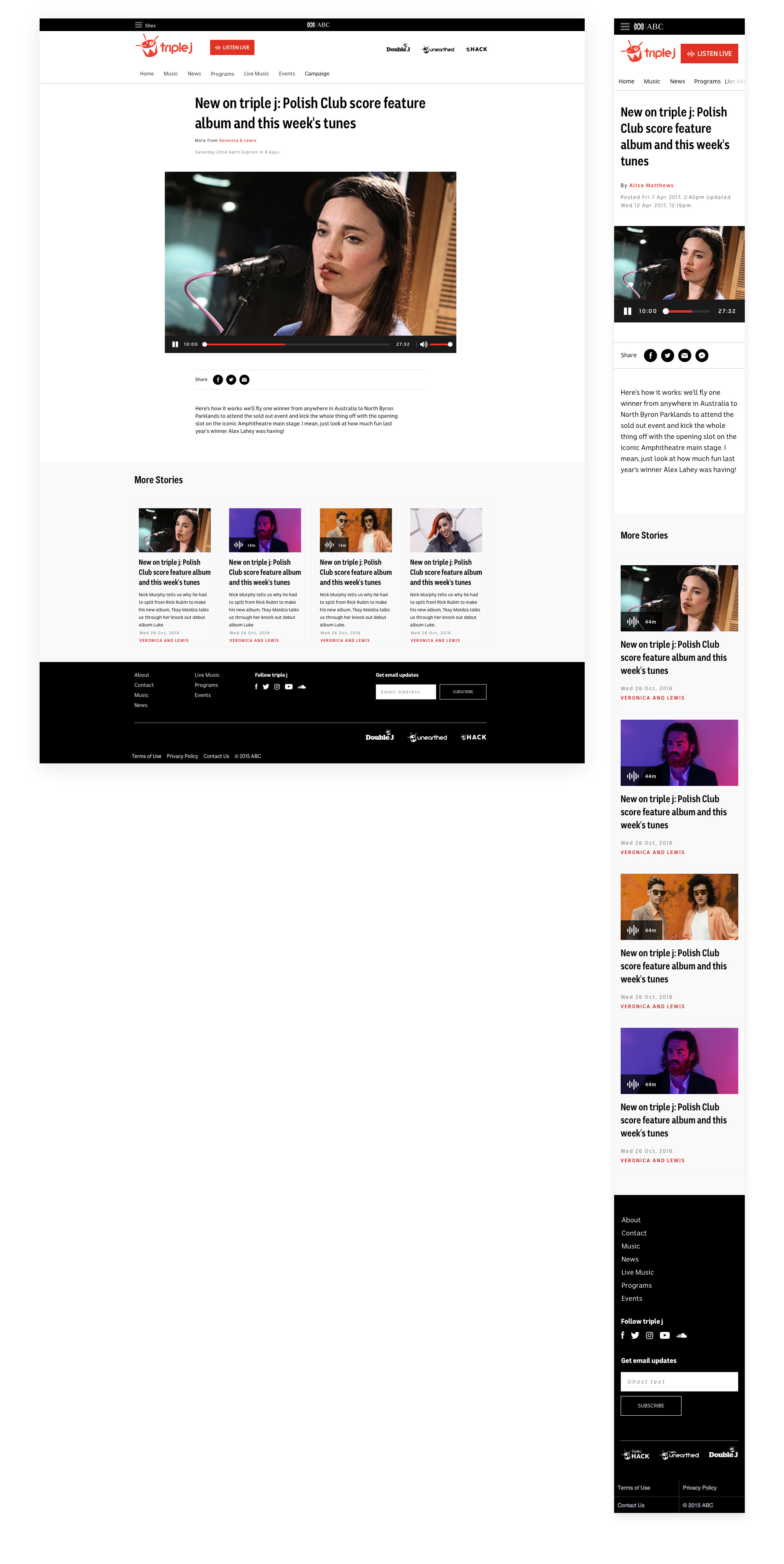
Article, audio and video episodes
The design uses clean and simple page layouts to present different content types, with recommendation paths to related content and social media sharing capabilities.
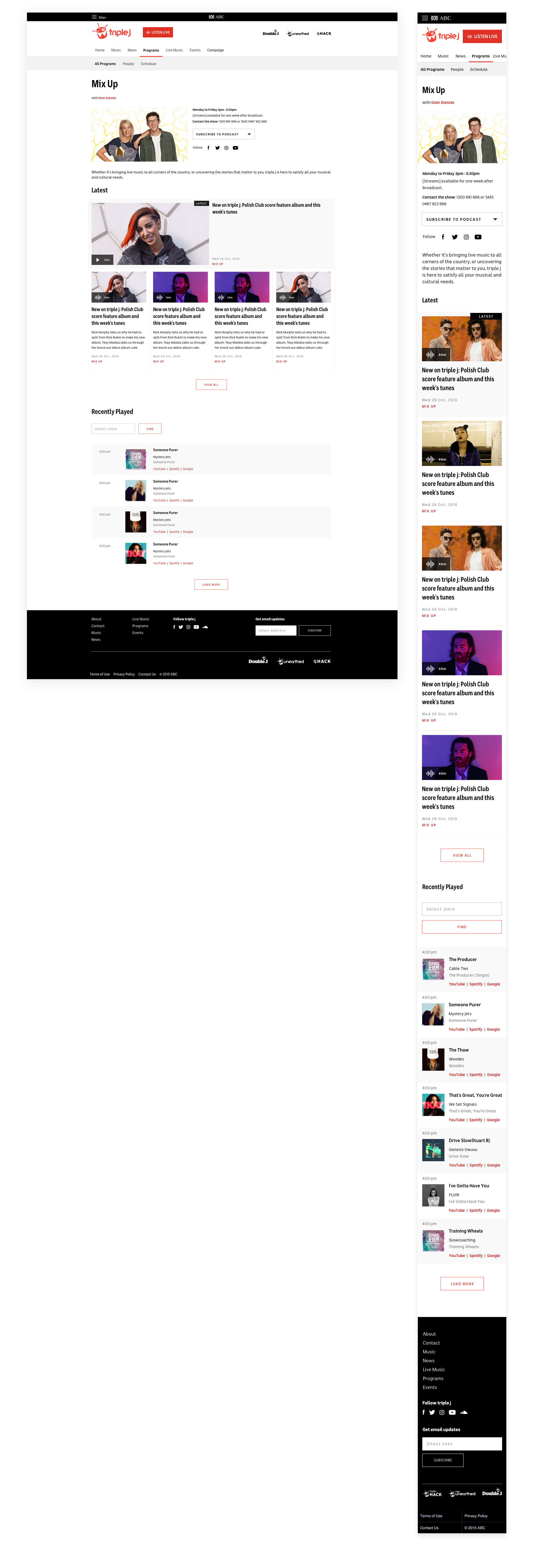
Program
Centralizing program-related content, including song playlists and program archives, is a key design goal.
Results
This clean and elegant responsive website showcases relevant content organised through a clear information architecture. Curated collections of articles, audio, and video provide triple j's audience with the latest music news, while an accessible "Listen Live" player experience keeps them up-to-date with music tracks. A successful collaboration with front-end developers, UX/UI designers, testers, technical writers, and content producers resulted in a seamless user experience that maintains triple j's iconic brand.
Working in a co-located team and having access to key personnel facilitated smooth project execution. This setup enabled efficient communication and problem-solving as we navigated a complex CMS and addressed technical challenges along the way.